This Numerical Aptitude Test will measure your proficiency in numerical analysis. The data is presented using charts or graphs. There are 10 questions on the test, and there is no time limit. We have dozens of numerical aptitude practice questions in our database. You’re welcome to retake the test as many times as you’d like.
You may not skip any of the questions on this numerical aptitude test. You must answer all 10 questions in order to receive your score. Your score will be shown immediately after you complete the test.
This is our 1st of 2 different numerical aptitude tests. You’re welcome to take the tests as many times as you’d like. The tests should contain different questions but they will all be of the same difficulty.
Data Analysis Numerical Aptitude Test 1
Quiz Summary
0 of 10 questions completed
Questions:
- 1
- 2
- 3
- 4
- 5
- 6
- 7
- 8
- 9
- 10
Information
You have already completed the quiz before. Hence you can not start it again.
Quiz is loading…
You must sign in or sign up to start the quiz.
You must first complete the following:
Results
Results
0 of 10 questions answered correctly
Your time:
Time has elapsed
You have reached 0 of 0 point(s), (0)
Earned Point(s): 0 of 0, (0)
0 Essay(s) Pending (Possible Point(s): 0)
Categories
- Not categorized 0%
- 1
- 2
- 3
- 4
- 5
- 6
- 7
- 8
- 9
- 10
- Answered
- Review
-
Question 1 of 10
1. Question
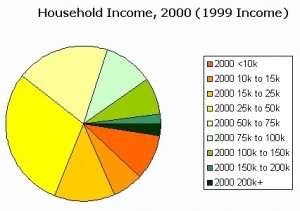
The chart graph below shows the household income for an undisclosed city.
Which answer represents the percent that could be the number of households that earned $75K to 100K?
CorrectIncorrect -
Question 2 of 10
2. Question
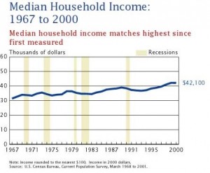
The chart graph below shows the median household income from 1967 to 2000. Figures are rounded to the nearest $100.
Which answer could not be the median household income for 1990?
CorrectIncorrect -
Question 3 of 10
3. Question
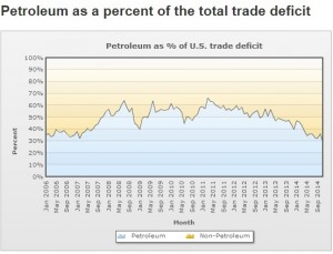
The chart graph below shows petroleum as a percent of the total U.S. trade deficit from May 2006 to September 2014.
What was the approximate difference of the total trade deficit for petroleum between the highest month and lowest month?
CorrectIncorrect -
Question 4 of 10
4. Question
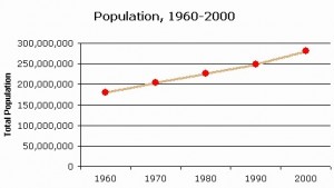
The chart graph below shows the U.S. population growth from 1960 to 2000 as reported by the U.S. Census Bureau.
In which year did the population reach approximately 250,000,000?
CorrectIncorrect -
Question 5 of 10
5. Question
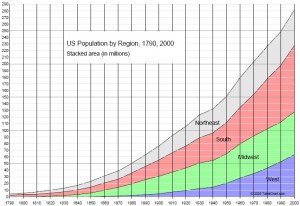
The chart graph below shows U.S.population by region from 1790 to 2000.
Which region experienced the most growth from 1960 to 1970?
CorrectIncorrect -
Question 6 of 10
6. Question
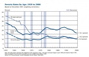
The chart graph below shows povery rates by age from 1959 to 2000.
Which age group showed the highest rate of decline in poverty from 1959 to 2000?
CorrectIncorrect -
Question 7 of 10
7. Question
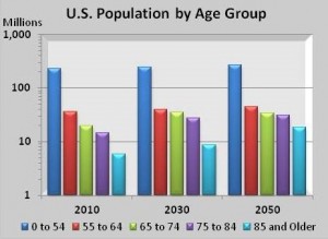
The chart graph below shows U.S. population by age group. Figures are shown in millions.
Which two age groups are expected to grow the least from 2010 to 2050?
CorrectIncorrect -
Question 8 of 10
8. Question
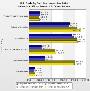
The chart graph below shows U.S. trade by end-use category for November 2014. Figures are shown in billions of U.S. dollars.
Which end-use category showed the largest deficit between imports and exports for November 2014?
CorrectIncorrect -
Question 9 of 10
9. Question
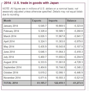
The chart graph below shows U.S. trade in goods with Japan for 2014. Figures are shown in millions of U.S. dollars.
During which month did the deficit between exports and imports decline the MOST?
CorrectIncorrect -
Question 10 of 10
10. Question
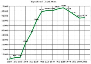
The chart graph below shows the population of Duluth, Minnesota, from 1860 to 2000.
During which decade did the population of Duluth increase the most?
CorrectIncorrect
